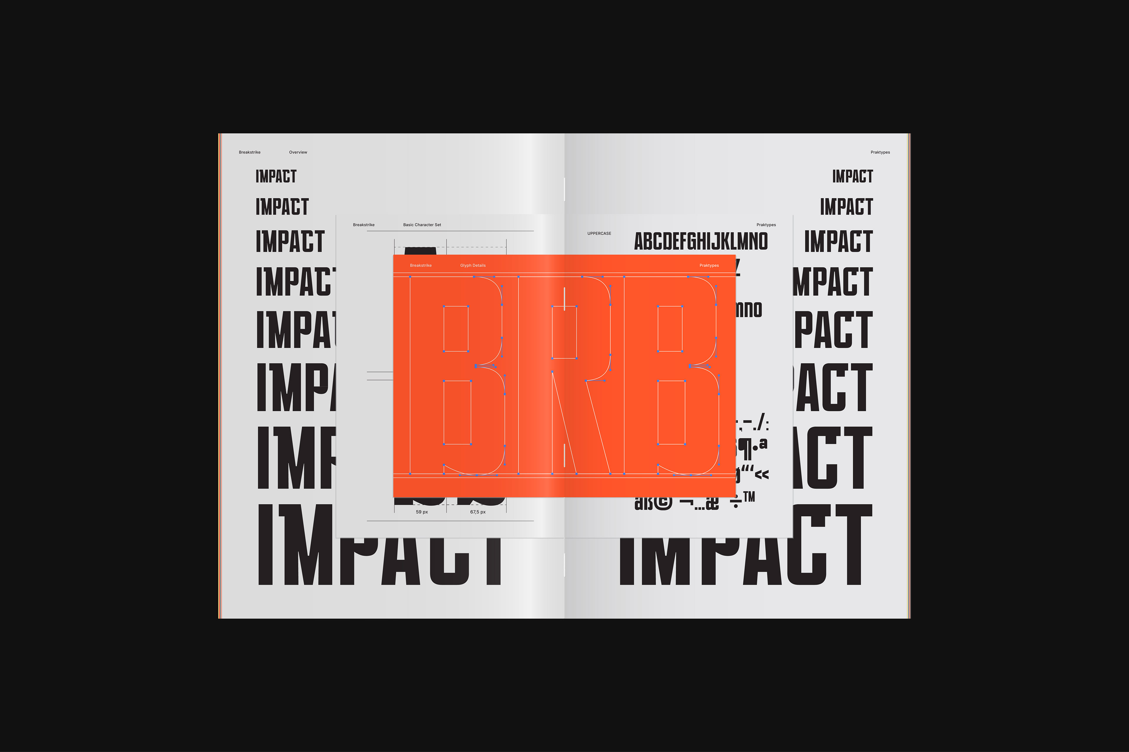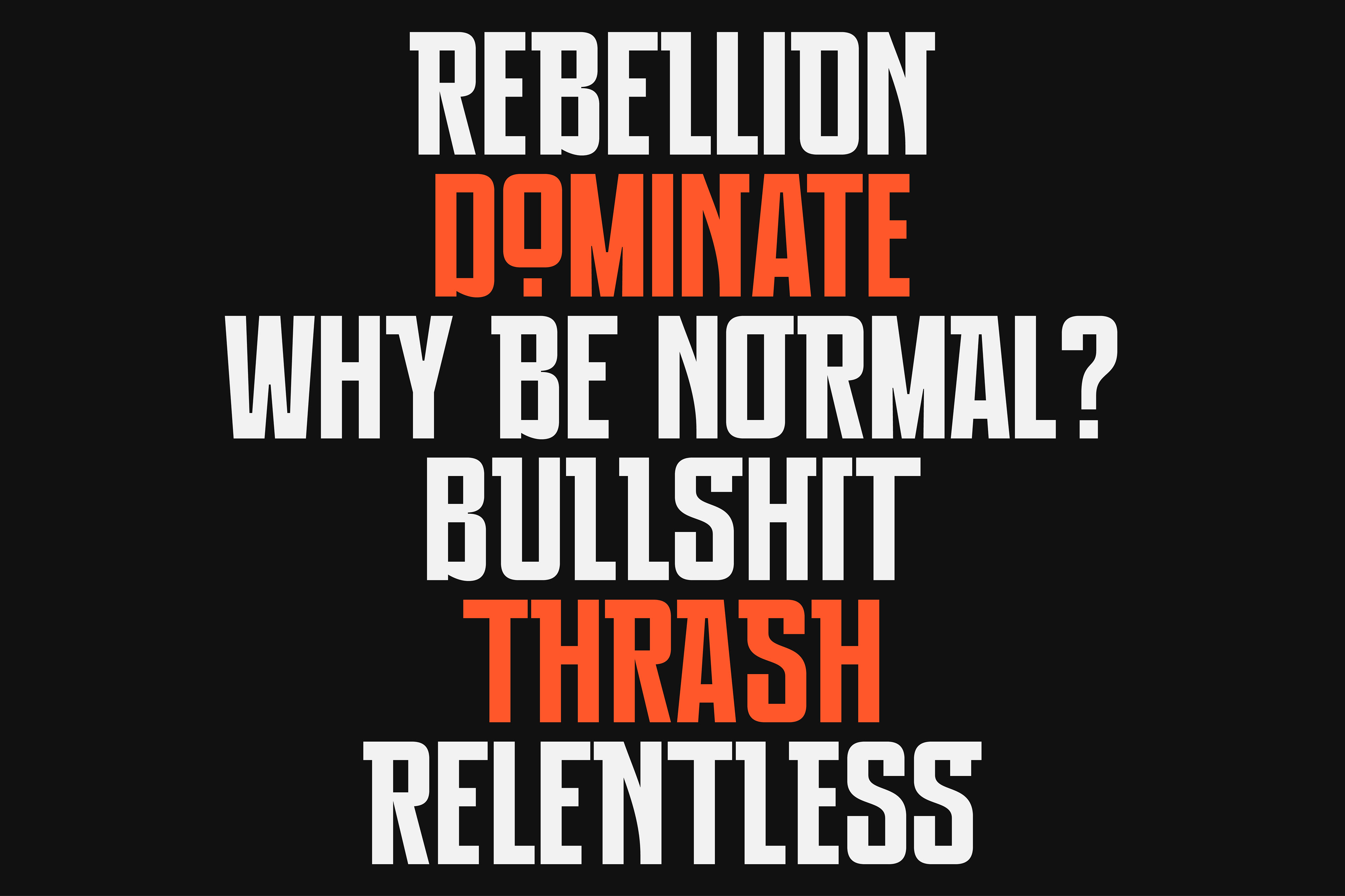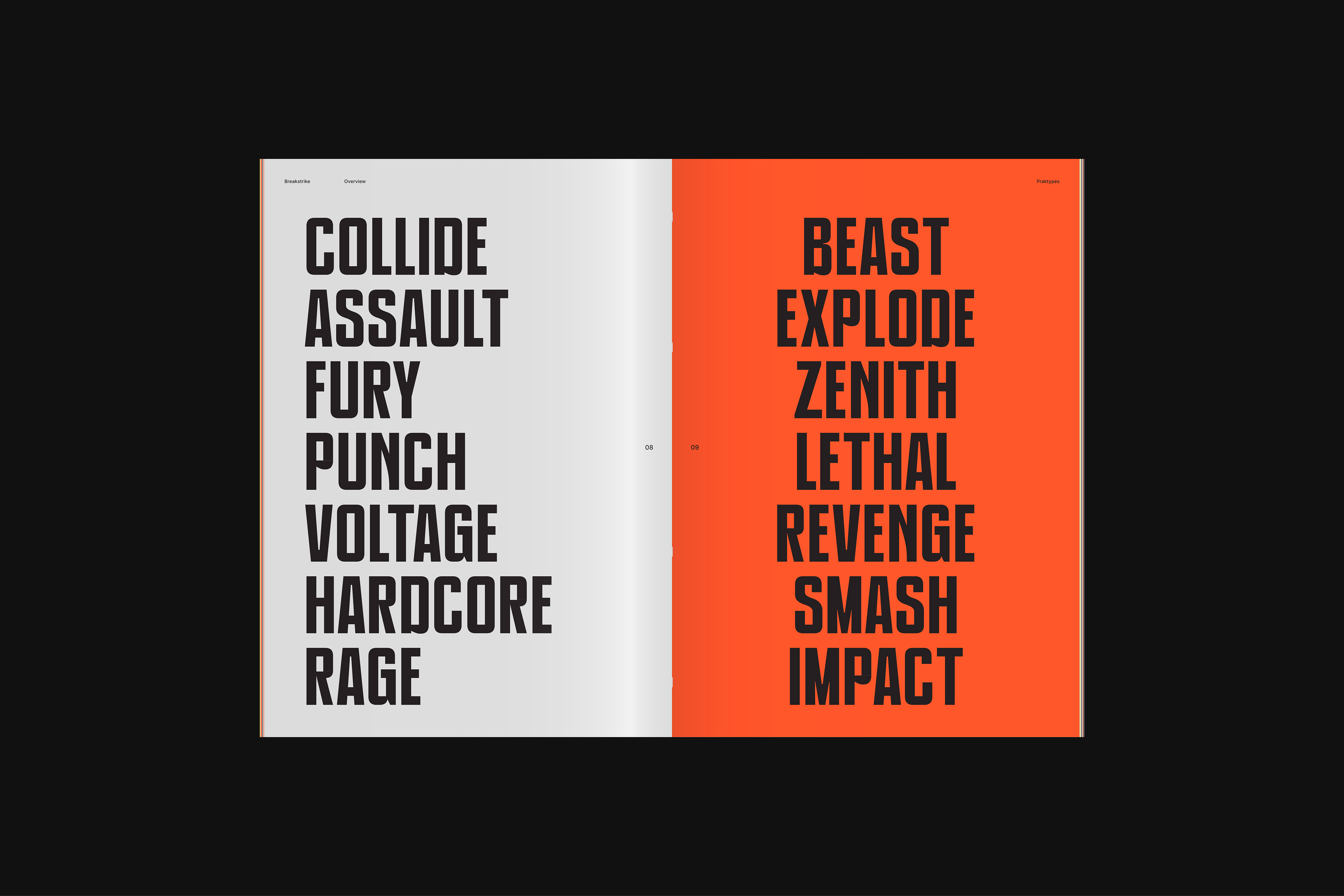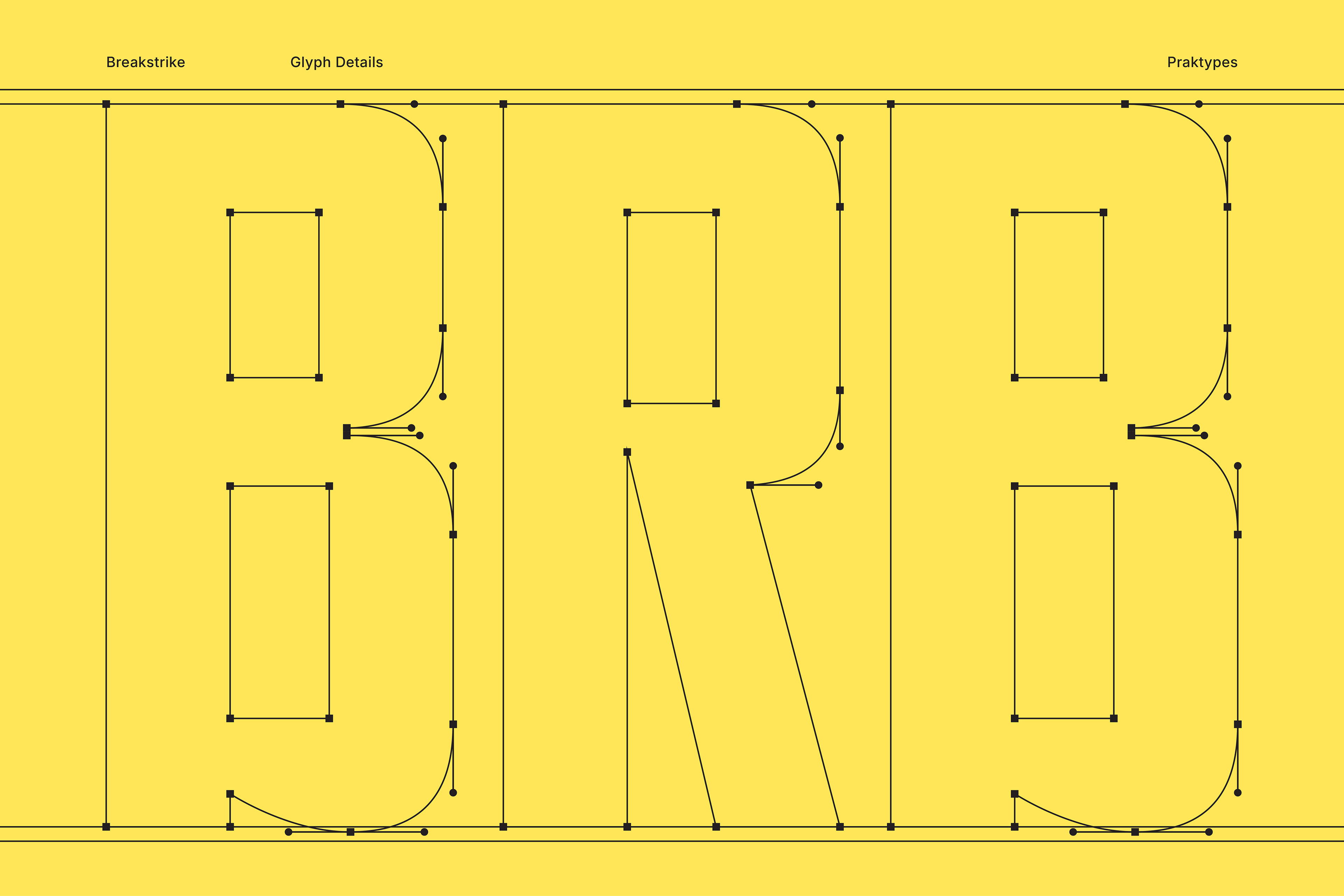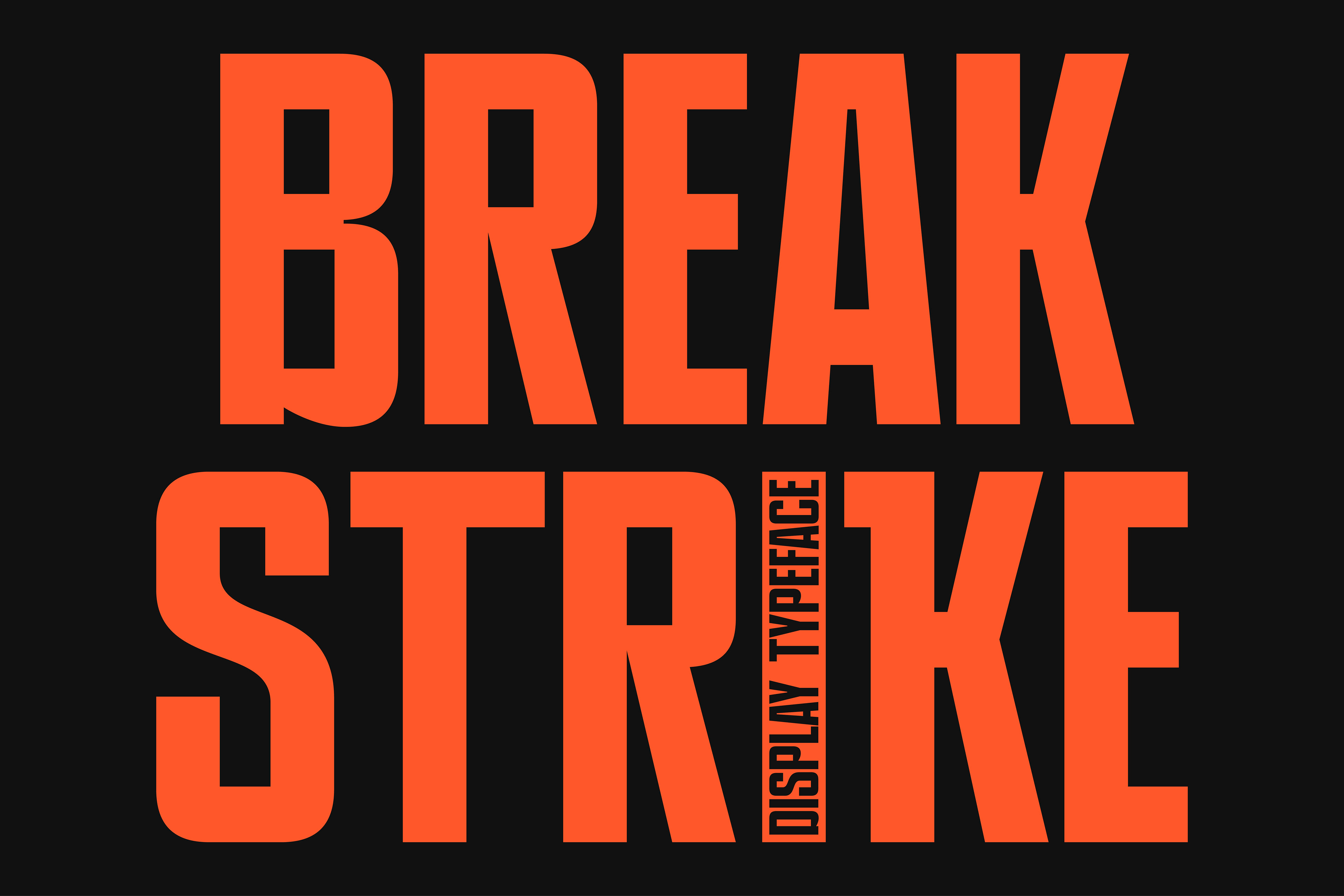
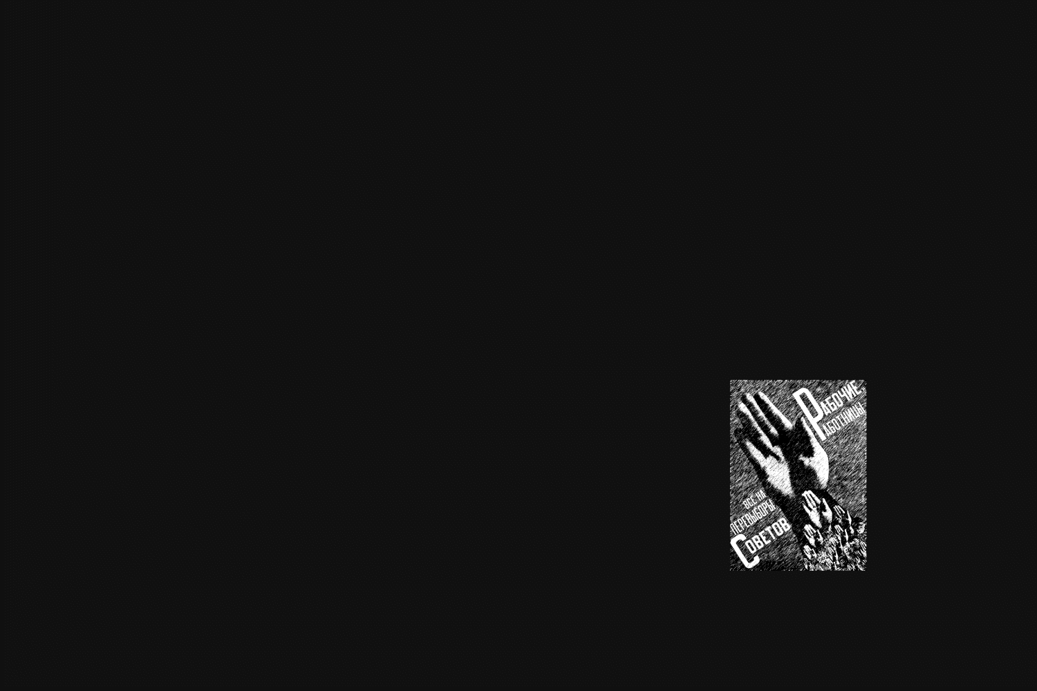
PRAK BREAKSTRIKE is designed as a typographic response to conformity. Inspired by vintage activism posters and the raw language of street culture, this typeface translates resistance into a modern grotesk condensed form. The concept behind PRAK BREAKSTRIKE is statement over decoration. Every letter is built to carry weight visually and emotionally. The condensed structure allows messages to stack tightly, creating pressure, urgency, and dominance within a limited space. This mirrors how protest messages are often forced to speak loudly in crowded visual environments.
PRAK BREAKSTRIKE exists to amplify voices that refuse to be softened.
It is not polite. It does not ask for attention.
It takes it.
It takes it.
Designed for designers who use typography as a weapon, not an accessory.
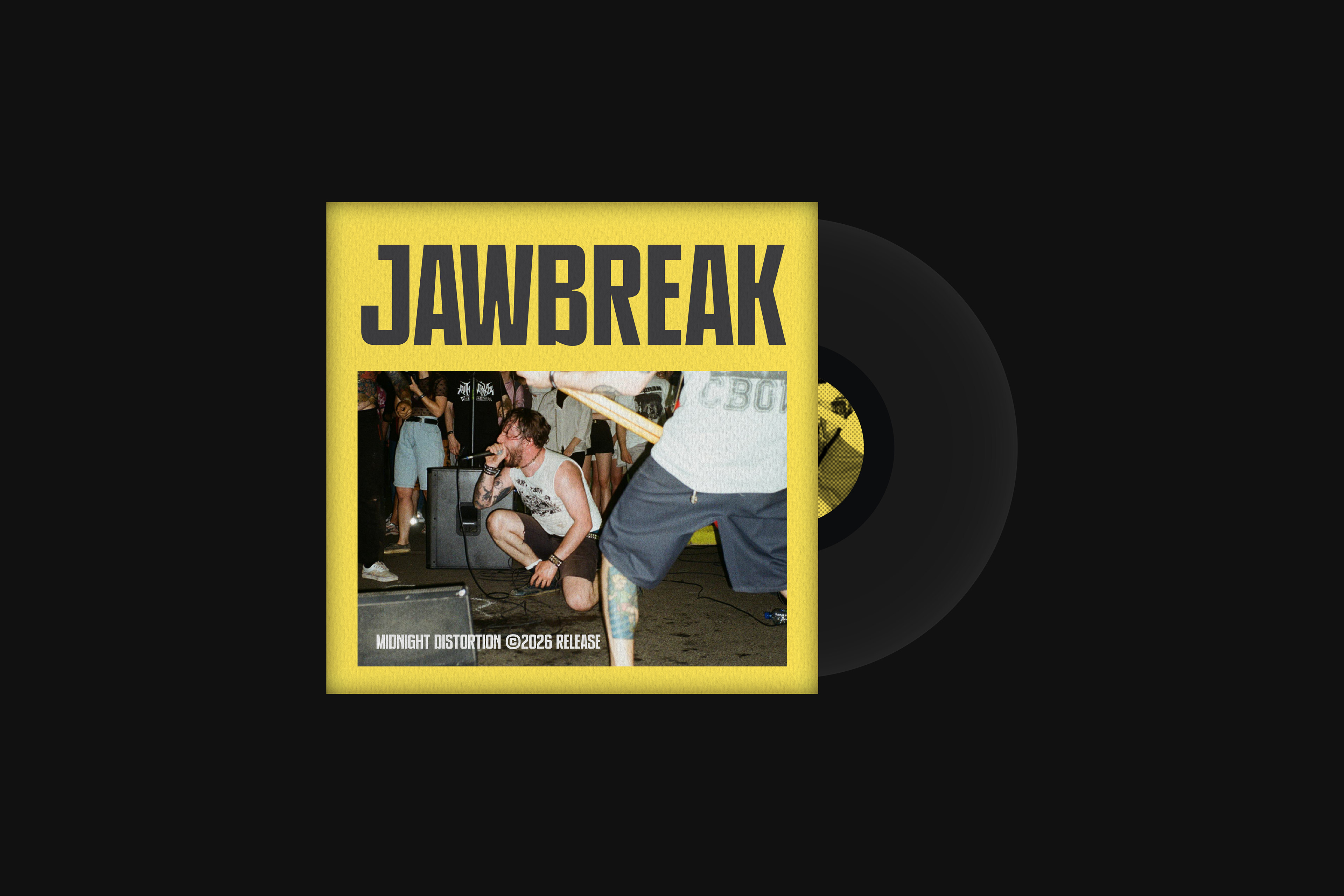
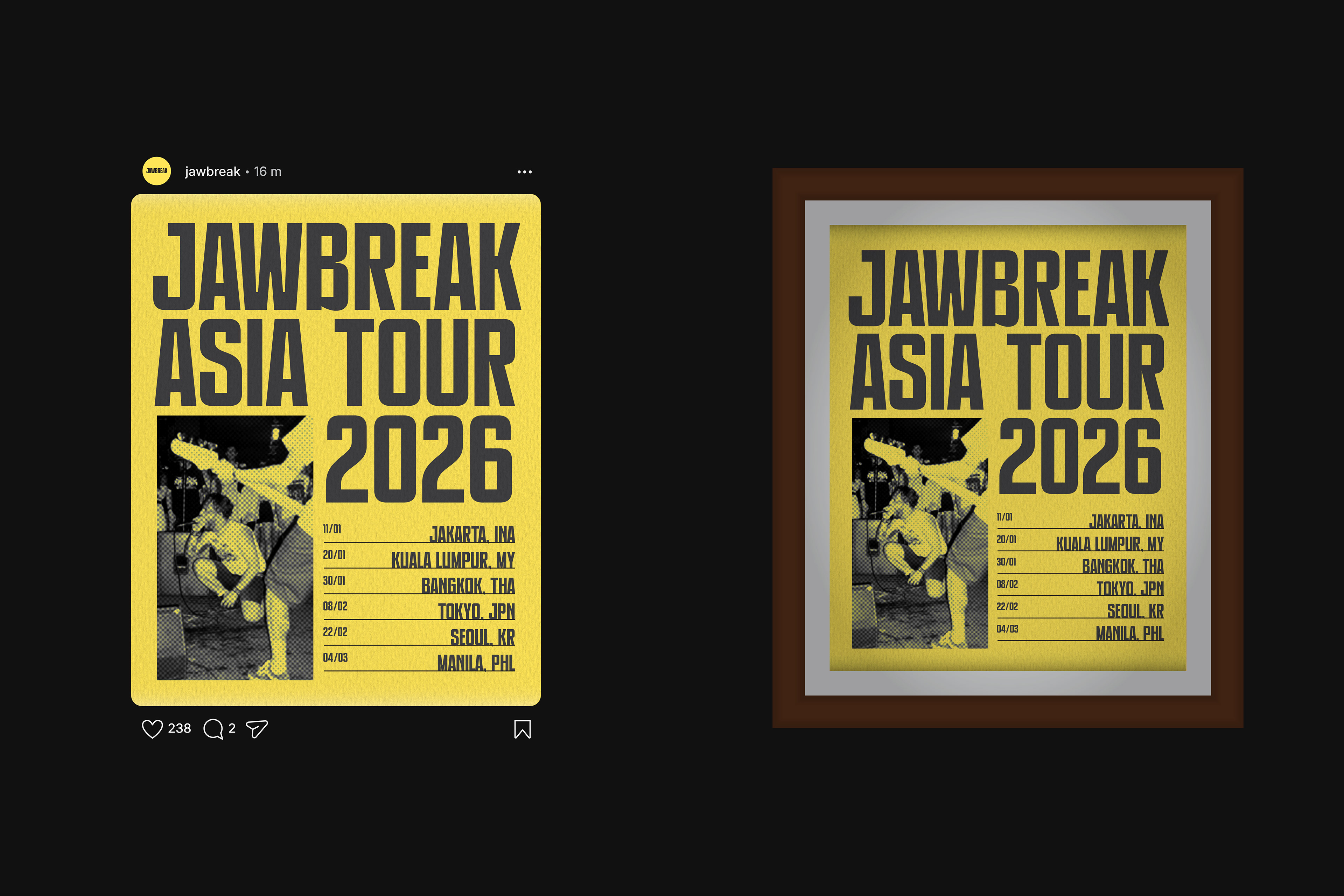
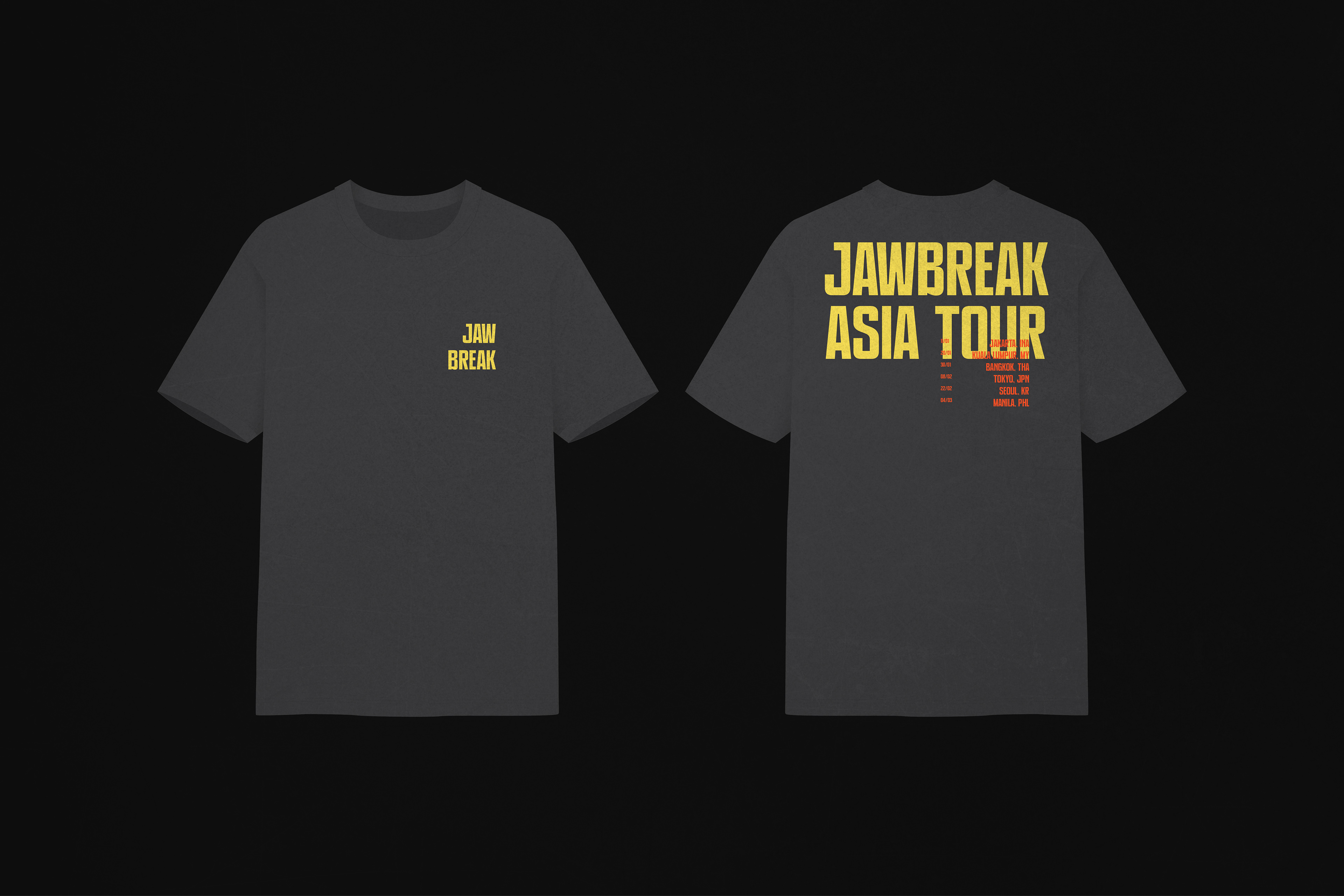
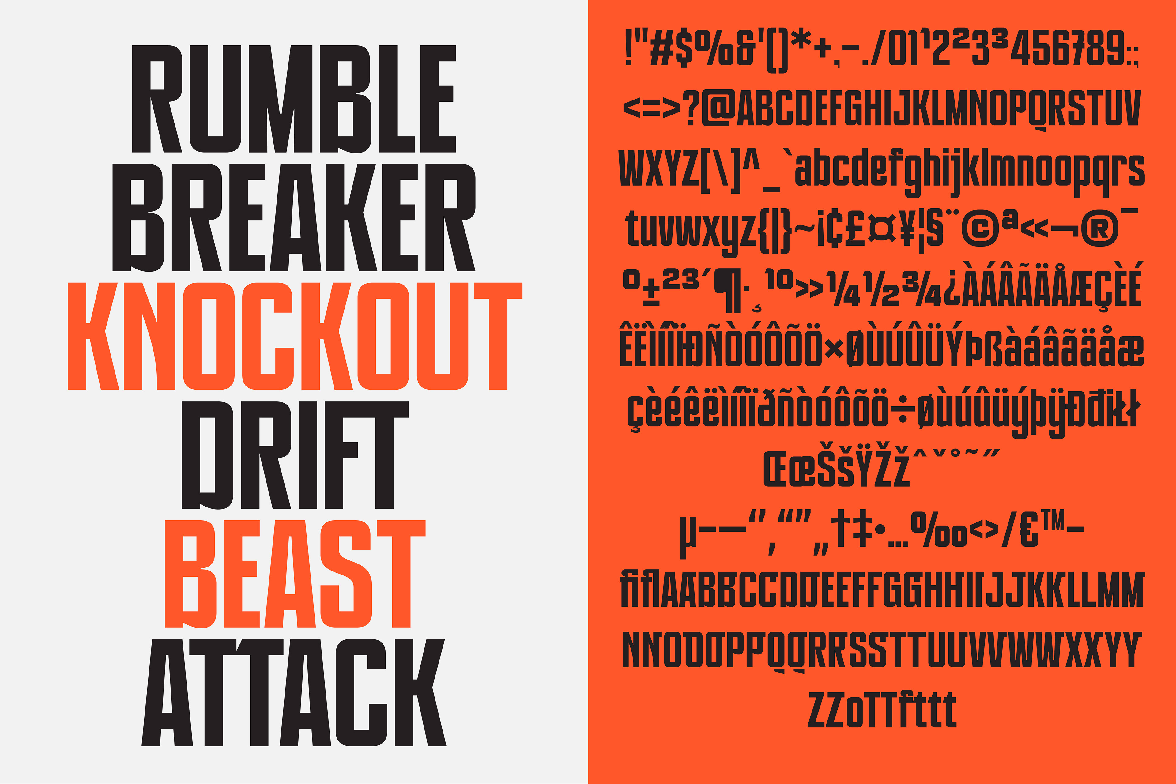
The mood of PRAK BREAKSTRIKE is bold, confrontational, and unapologetic.
Visually, it draws from: Vintage protest posters, Activism headlines, Street signage and underground movements
Emotionally, it communicates: Defiance, Urgency, Confidence, Dominance
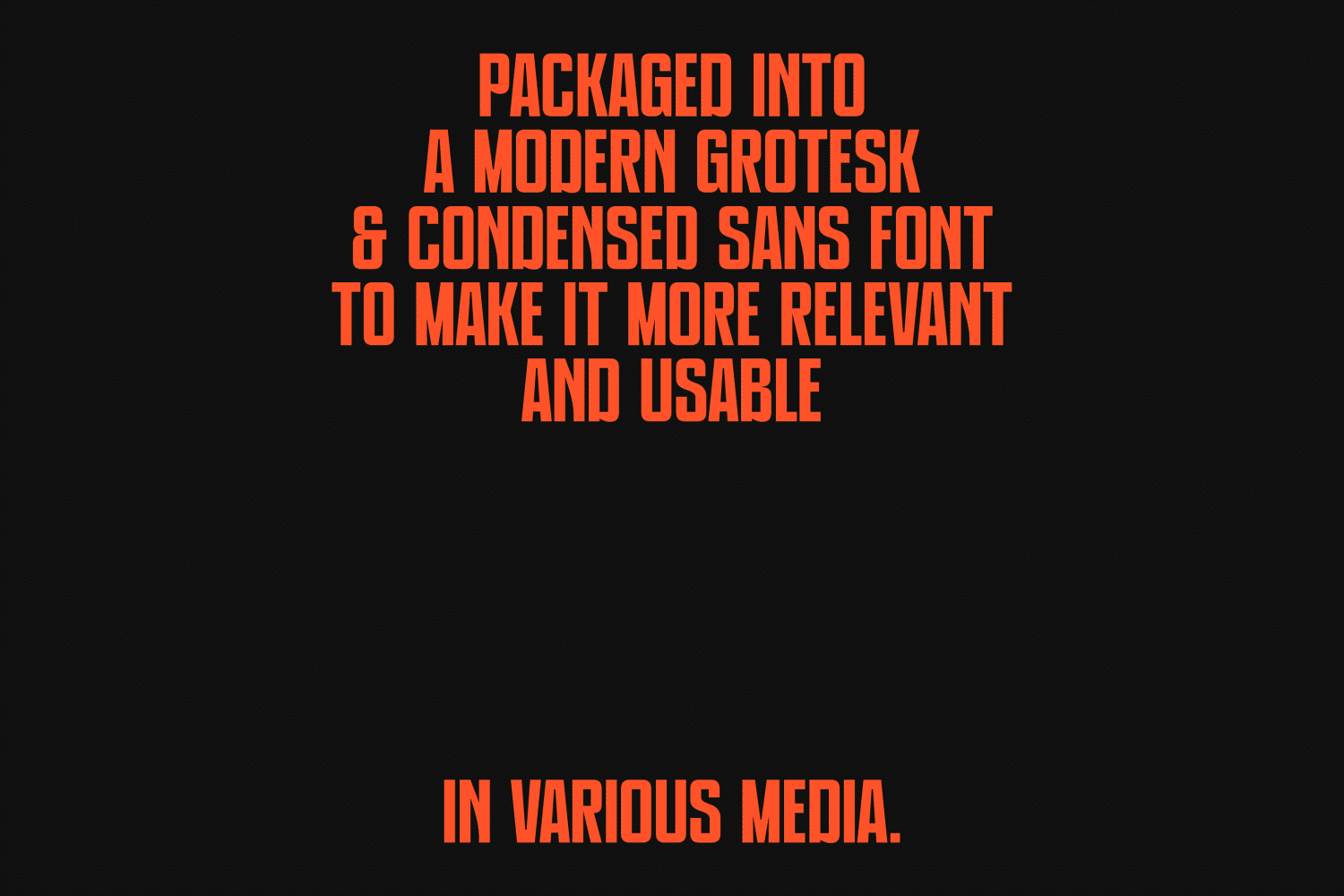
Every letterform is crafted to feel aggressive yet controlled balancing old-school resistance energy with a clean, modern construction. Tight spacing, strong vertical rhythm, and solid weight make PRAK BREAKSTRIKE ideal for impactful statements, powerful headlines, and visual narratives that refuse to be ignored.
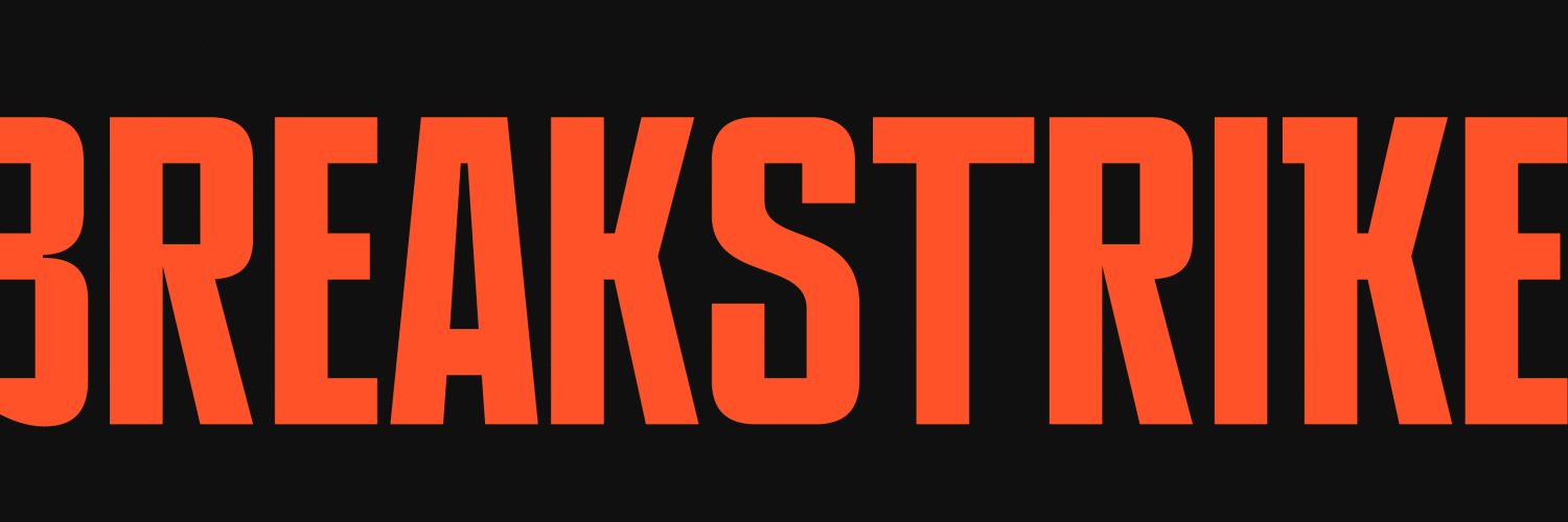
The strong vertical strokes and tight proportions create a sense of pressure and control, while the clean grotesk construction keeps the typeface grounded in modern design language. This tension between rebellion and structure is intentional reflecting how chaos and order often coexist in street movements.